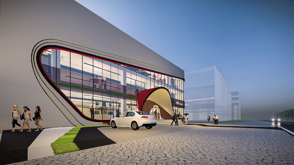
This
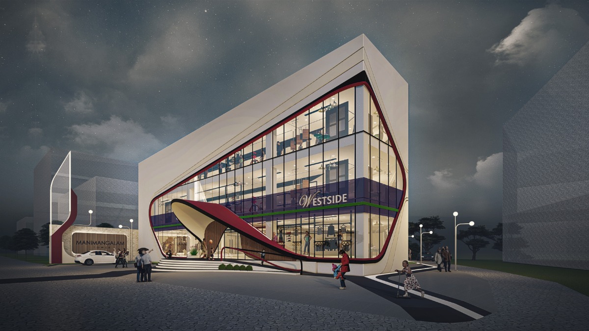
commercial building lying on a corner site demanded a landmark look for the
immense traffic forming at the road junction. It was calling out against
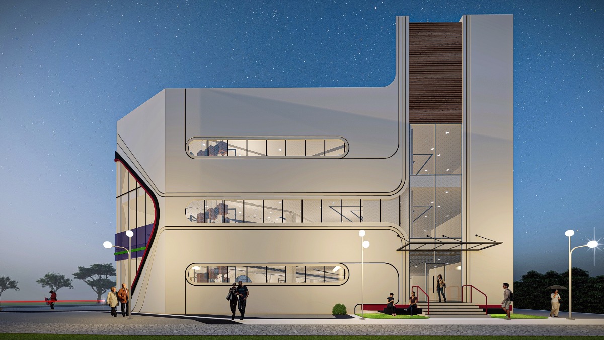
looking like any generic commercial complex. Being a cuboidal building, there were not much form variations that could be done to instill the visitor’s interest. With
the bottom two floors reserved for a textile brand, we got the privilege of
uniformity in case of branding. The incoherence of multiple brand identities
and logos cramped together make it exceedingly difficult for shopping complexes
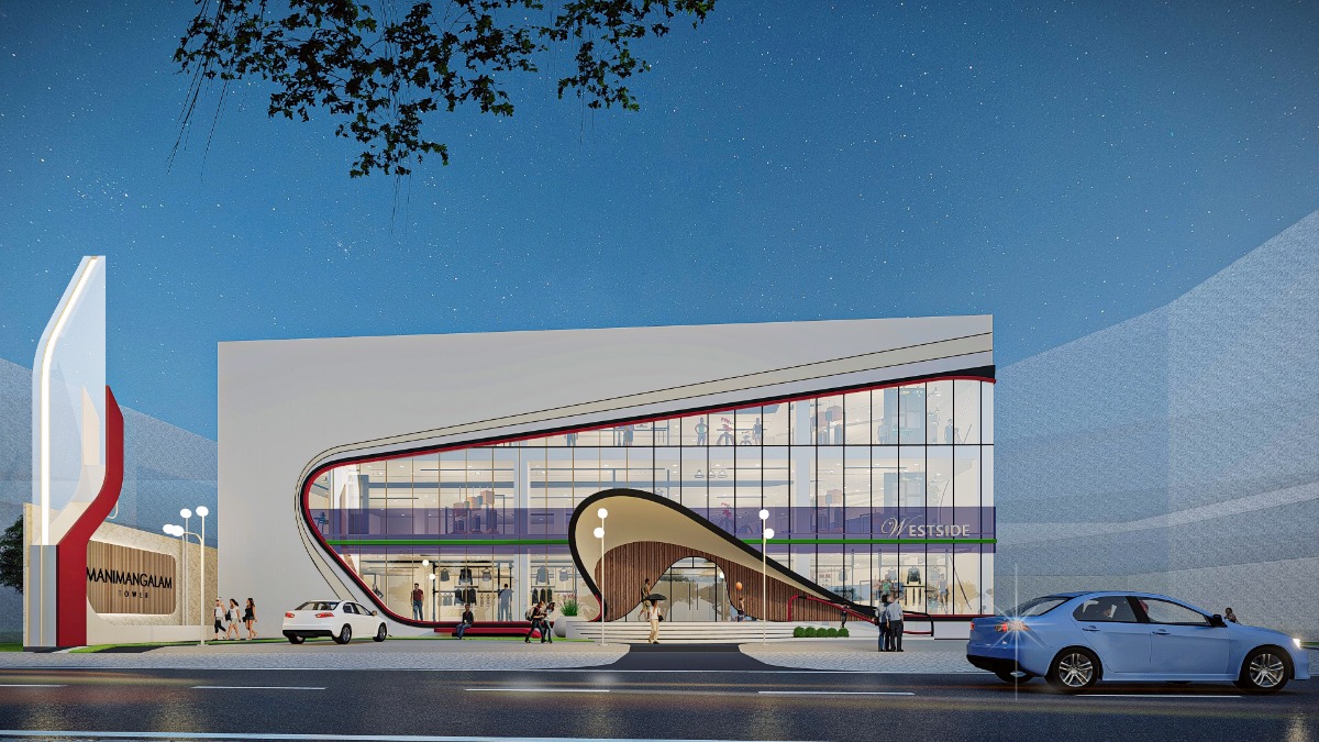
to have any character of their own. White was chosen as the main color which is
soothing to the eye and reflects more light. Maroon was chosen as the highlight
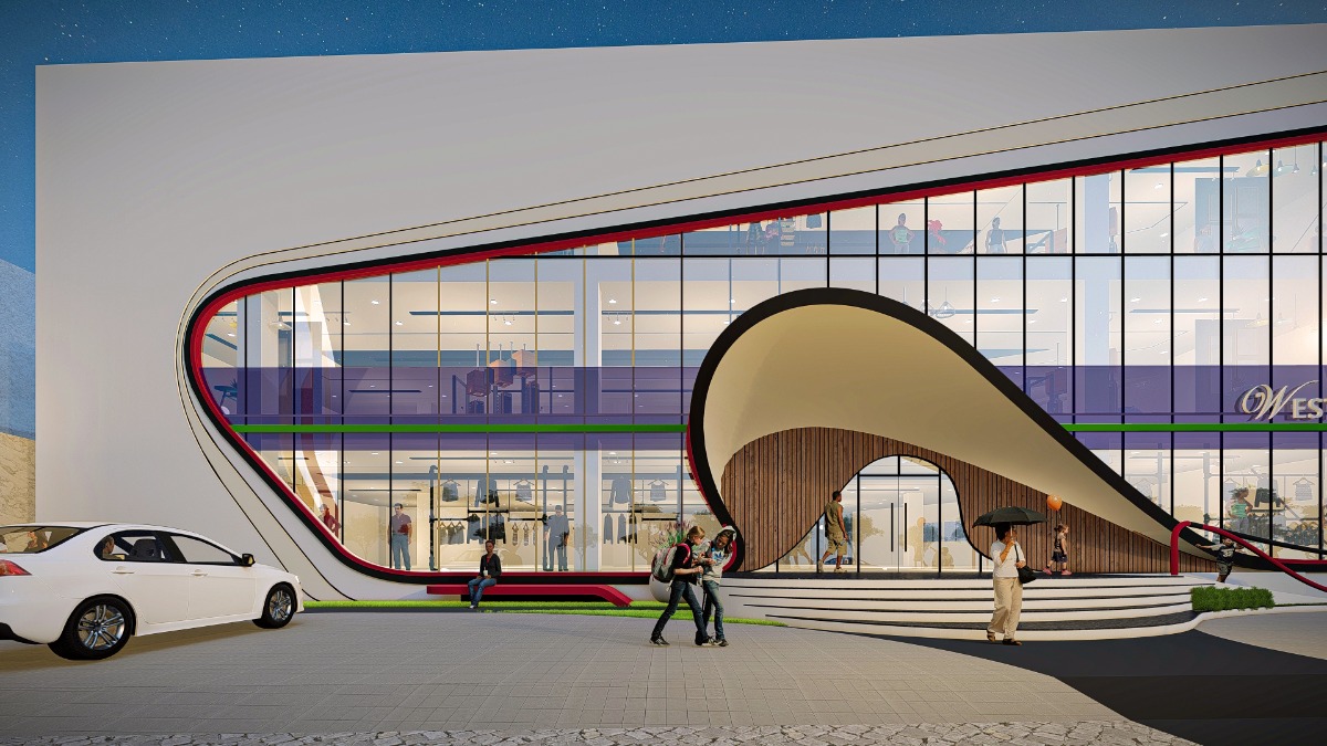
color which was taped across the building façade. Keeping maximum glass display
for the buyers’ engagement, a curvilinear band was made to cling on the two
main walls which bound together to form a dramatic cantilevered entrance canopy
of ferro-concrete. The leading steps were made to reflect the canopy profile which
so as to help engage the onlookers from the very first tread.
Manimangalam Tower, Kerala
